Curate Your Zoom Meeting Background
If your daily schedule consists of virtual meetings, or if you have an important presentation coming up, consider updating your Zoom meeting background as a step towards improving your confidence and intriguing your audience. The virtual rectangle assigned to each person is often the first impression for many relationships these days, so use what is available to enhance your virtual image.
-

Photo courtesy of Ekaterina Bolovtsova.
Breaking Down the Elements
A virtual rectangle is a blank slate for a beautiful compilation of objects that encapsulate your personal image. Our workspace appears as a two-dimensional image on a screen, so treat it as a blank canvas for your masterpiece.

Photo courtesy of Polina Zimmerman.
When considering your space, it is important to take stock of every component in the room and understand how it communicates with your audience. What does it say about you, and how does it make your viewer feel? Most importantly, how does it make you feel? Use your virtual canvas to send a message to the viewer – approach it like an art form.
Elements of Art to Consider in Your Zoom Meeting Background
Directional lines create movement in a stagnant frame – they direct the eye around the canvas. It’s great to differentiate the lines in your space by incorporating chic shelves. Use long and short lines in conjunction with one another to create a balanced harmony.
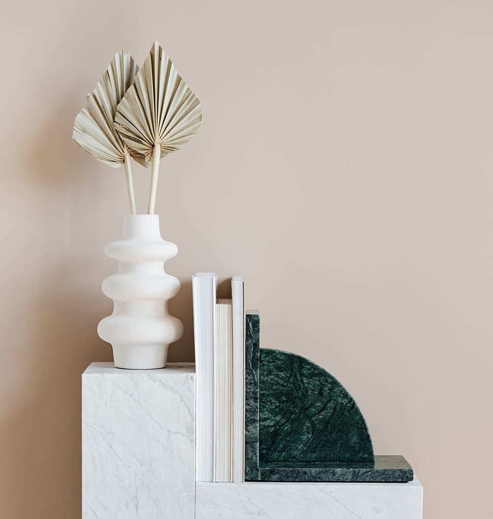
Photo courtesy of Karolina Grabowska.
Placing short linear objects on long shelving creates an intersection which allows the eye to flow through the space. Layer in unique shapes with these lines such as circular vases, trays, and other fun items for an extra flair.
Color
Color can make or break your Zoom meeting background. It is important to keep your color palette limited to three complementing colors so the backdrop won’t distract your viewer. Black and white can be great to use as a base for your palette – the contrast is striking but not overwhelming.

Photo courtesy of Henry & Co.
When you bring black and white into your Zoom meeting background, look for different values – variations of how light or dark something is on a monochromic scale – to create dimension in your frame. Use the grayscale to create a common color scheme; you can even accessorize with blue, brown, red, or any color of your liking.
Texture
Texture also is essential when creating dimension on a flat screen. Think about adding a variety of materials such as glass, metal, marble, wood, etc…. Antique objects are a brilliant addition to any room; the juxtaposition of an older piece in a modern interior adds an eye catching detail without crowding the space.
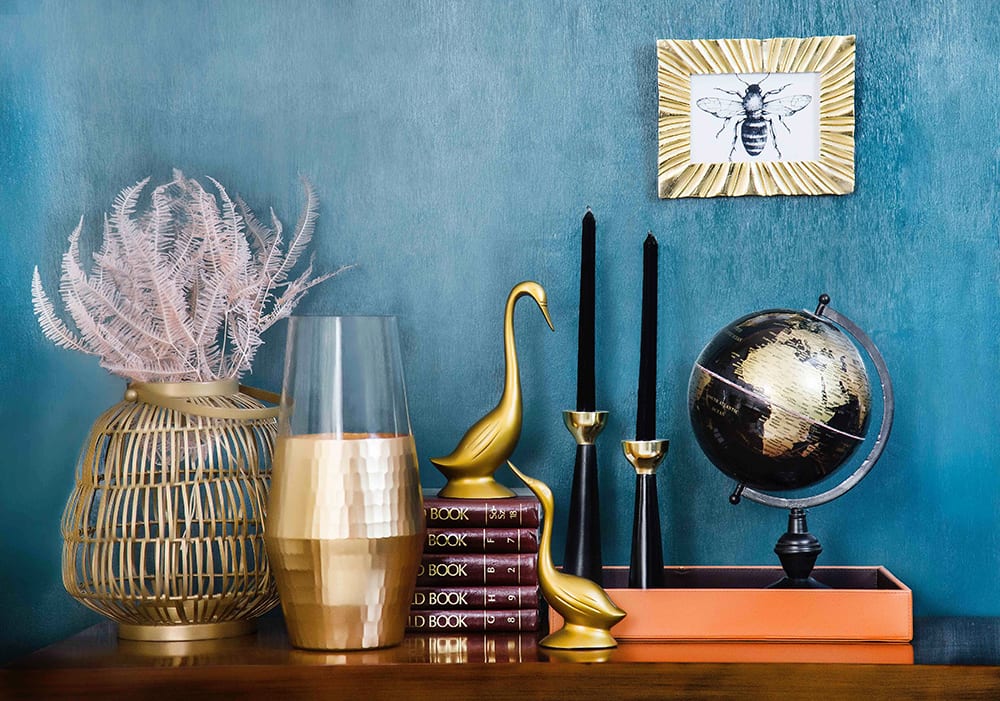
Photo courtesy of Sammsara Luxury Modern Home.
Lighting
Lighting also has the potential to completely transform a space, turning your virtual meeting backdrop into a work of art. Avoid light that comes from one direction and instead consider how you might incorporate lighting from sources at different heights.
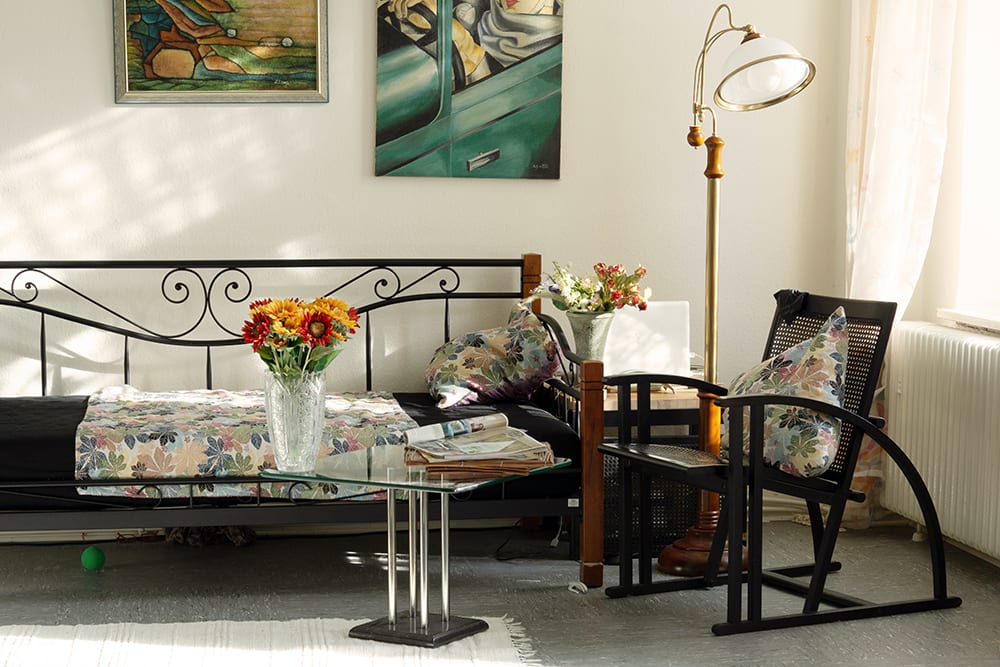
Photo courtesy of Ulrike Häßler.
It is not unheard of for meetings to occur at night so be sure to design your space for any situation. You can add a range of light sources to your meeting space such as table lamps, floor lamps, task lights, and ceiling lights. And remember: not all light sources are going to come from inside the frame. If you don’t have a natural light source facing your virtual background, try using a ring light or diffused light as a substitute for windows.
Accents & Personality
If you want to add a bit of personality to your virtual meeting background, try layering a favorite book or a small piece of art into your space. If you are an artist or a designer, this is a great opportunity to showcase your work. Small details such as these make for great conversation starters and encourage audience curiosity.
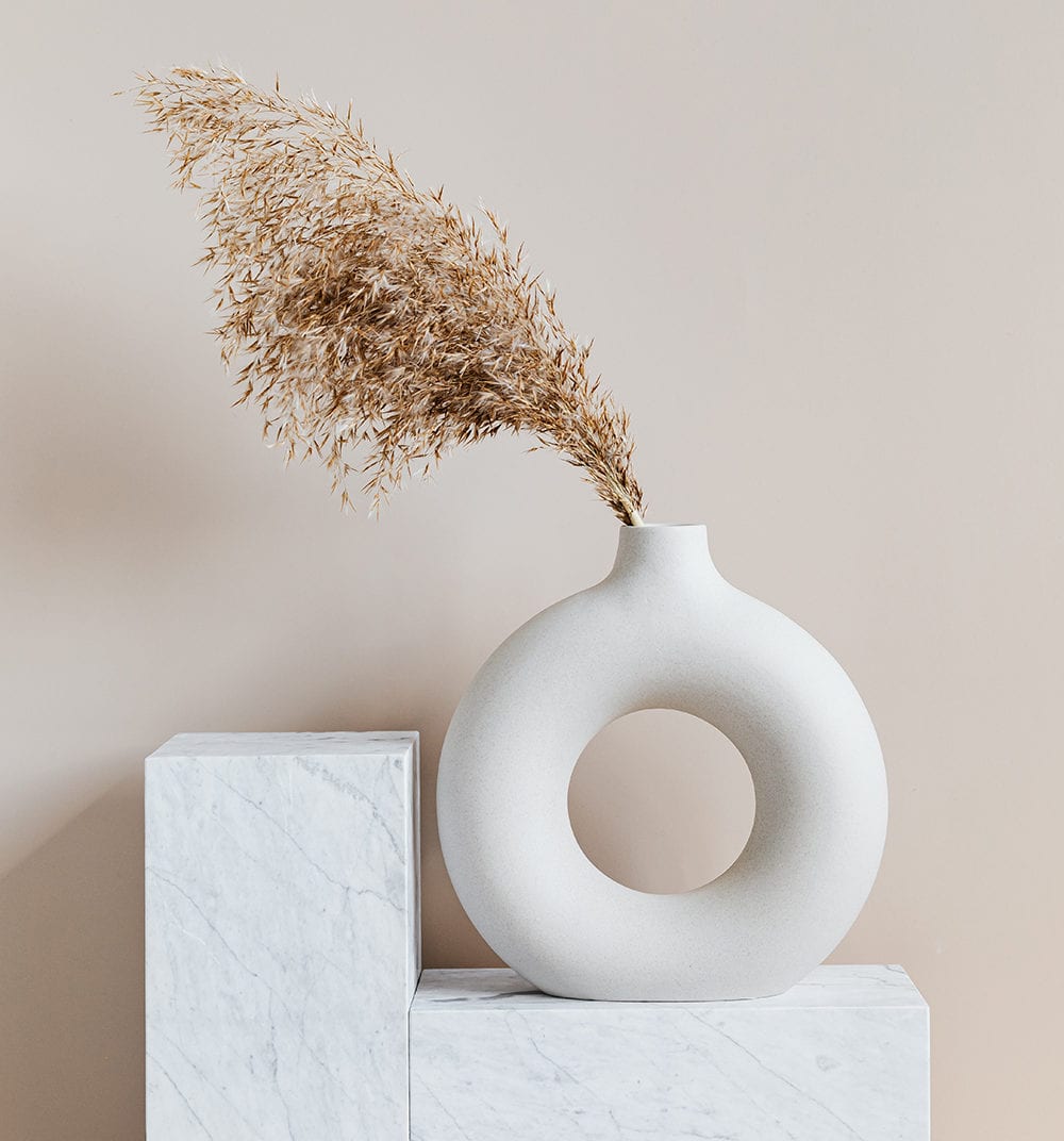
Photo courtesy of Karolina Grabowska.
If you plan to use brown and golden tones, plants are the perfect way to contrast the colors in your space. Try incorporating a simple succulent or vase of flowers to enhance your virtual meeting background aesthetic.
With working from home becoming the new normal, we are now one with the screen and all that it contains, so let the backdrop reflect your personality. Add items to your surroundings that you have a personal connection to such as souvenirs from your travels or a cherished photograph.
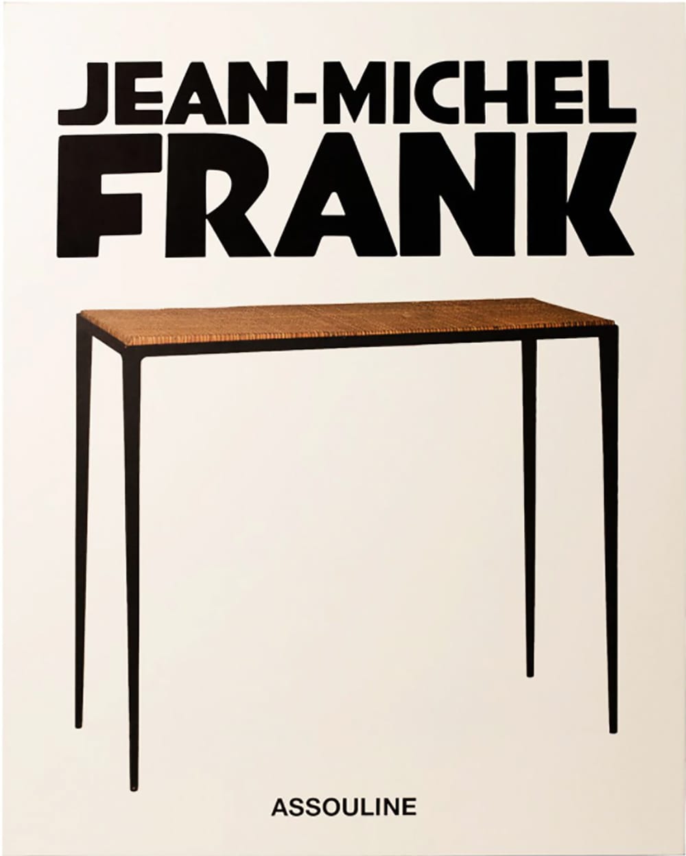
Available for purchase on Farfetch.com
When it comes to books, try showcasing titles that reflect your interests. For example, if you’re an interior designer, you may want to check out the Jean Michel Frank coffee table book from Assouline.
Choosing Art
Art speaks measures when added to a blank surface. A large piece of art with a minimal color palette can create balance and add texture to the two dimensional virtual meeting box. The virtual frame is your canvas for creating a beautiful scene, but a busy piece of art can take away from your overall aesthetic.
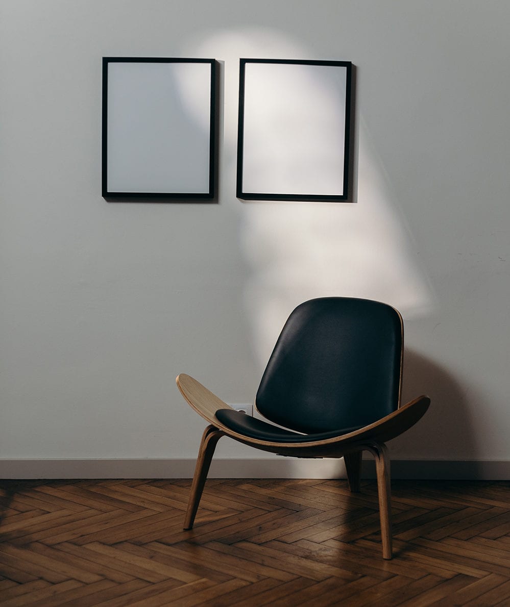
Photo courtesy of Cottonbro.
Simplicity is vital when choosing your art; this might mean using a black and white photograph or an abstract painting as the main point of color in your frame. Deciding where to place your art is also key to creating balance. Look for a wall with few distractions – a white wall is a great base if you want to include more color in your space.
Your Zoom Meeting Background: Key Things to Remember
A workspace with few colors and decluttered decor can help bring you heightened focus and productivity during your meetings. It’s important to maintain a clean desk free of any unnecessary objects. Rather than attempt to create dimension with a variety of knickknacks and bobbles, try using a select few items made of intricate materials, such as marble, for an eye catching Zoom meeting background that isn’t too crowded.
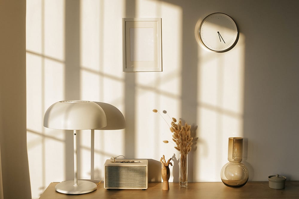
Photo courtesy of Ann Nekr.
When choosing the location of your workspace, be sure to avoid doorways, windows, and deep open spaces between the desk and wall. Doors and windows create an opening in your area that can disrupt the feeling of privacy – plus you run the risk of someone appearing in the frame of your background. Instead, try staying close to a wall that faces a natural light source to minimize glare and eliminate distractions. If you follow these steps, you’ll be sure to have a Zoom meeting background that maintains audience engagement and curiosity while showcasing your personal aesthetic.
Written by Haley Hudson
Other Items That Will Update Your Zoom Meeting Background:

Deny Design, The Shore, available for purchase on Nordstrom.com.

Helle Mardahl, Candy Glass Dish Set, available for purchase on Farfetch.com.

Hooker Furniture, Nathan Eglomise Bookcase, available for purchase on NeimanMarcus.com.

Mitchell Gold Bob Williams, Large Knot Object, available for purchase on Bloomingdales.com.

